Weather in Washington, D.C. Over 72 Hours
Data Visualization
Project Overview
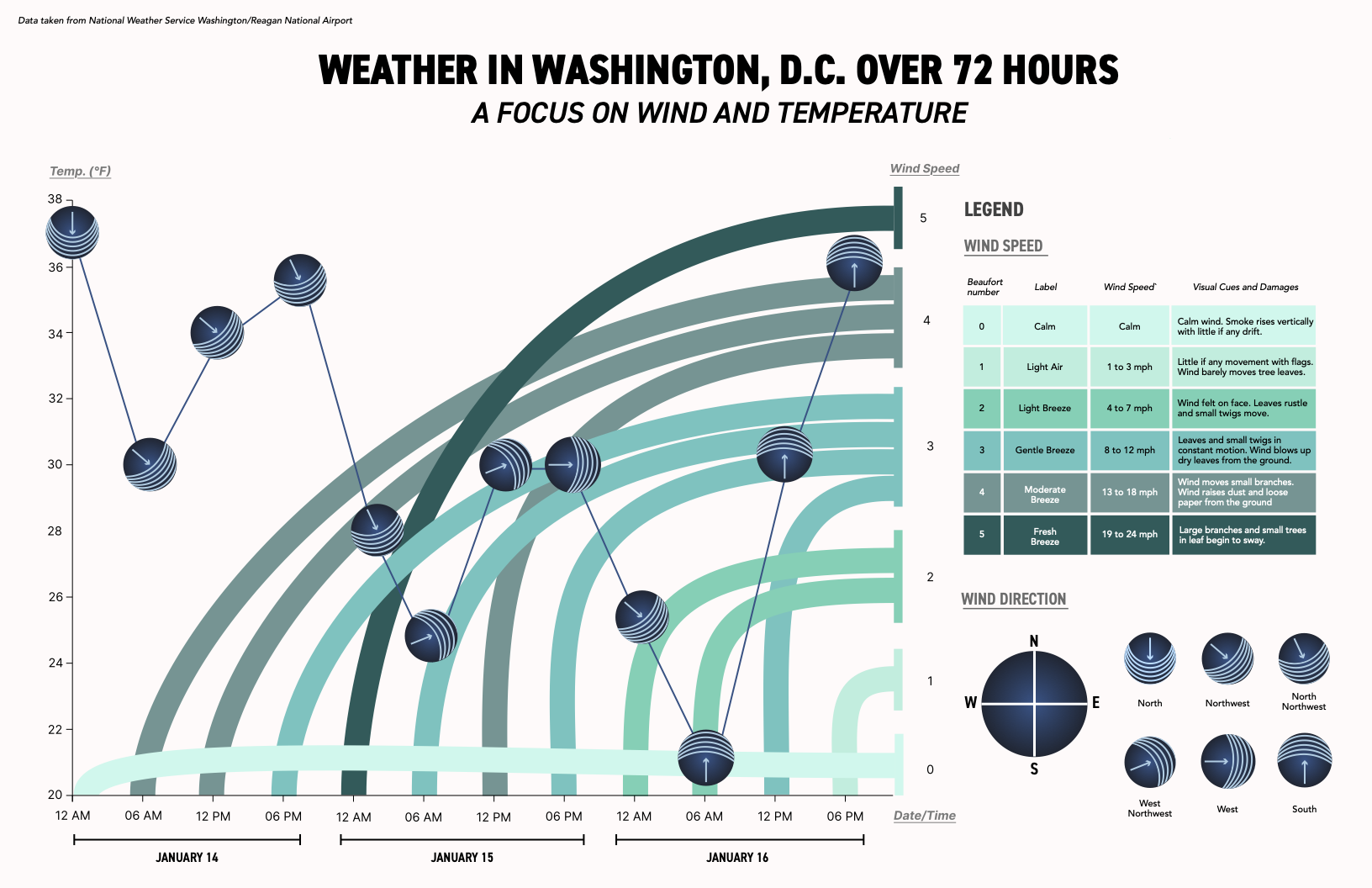
This visualization explores wind speed, wind direction, and temperature in Washington, D.C. over a 72-hour period. Using data from the National Weather Service, I designed a visual system that highlights how temperature fluctuations relate to wind patterns in a way that is both easy to read and visually expressive.
Process
Because wind can be visually complex, I built a legend system that breaks it down into digestible parts.
The Beaufort scale categories are paired with clear labels, speed ranges, and visual cues to help viewers understand how each arc represents wind intensity. By integrating real-world descriptors, like “Gentle Breeze” or “Fresh Breeze”, the legend bridges technical data and intuitive understanding.
I also created a complementary set of directional markers that sit at each temperature point. These icons borrow from meteorological symbols but are simplified to align with the overall graphic style. The legend clarifies how to read these angles, showing how each arrow corresponds to the direction the wind is moving
This system ensures that even viewers with no meteorological background can fully interpret the visualization.
The biggest challenge was displaying three variables, temperature, wind speed, and wind direction,without overwhelming the viewer. Each variable needed its own role within the composition.
Temperature forms the main timeline, using a simple line to maintain clarity.
Wind speed is conveyed through layered arcs that increase in thickness and saturation as speeds rise.
Wind direction is displayed through custom icons at each temperature point, using subtle angles and linework inspired by meteorological symbols.
Separating these roles visually allowed the data to stay readable while still feeling integrated and cohesive.
Key Takeaways
This project strengthened my understanding of how to balance expressive visual storytelling with quantitative accuracy. I learned how subtle shifts in spacing, color, and line weight can dramatically impact readability, and how important it is to design supporting elements, like legends and icons, that enhance clarity rather than clutter the page.