Alcohol Consumption & Public Health
Data Visualization
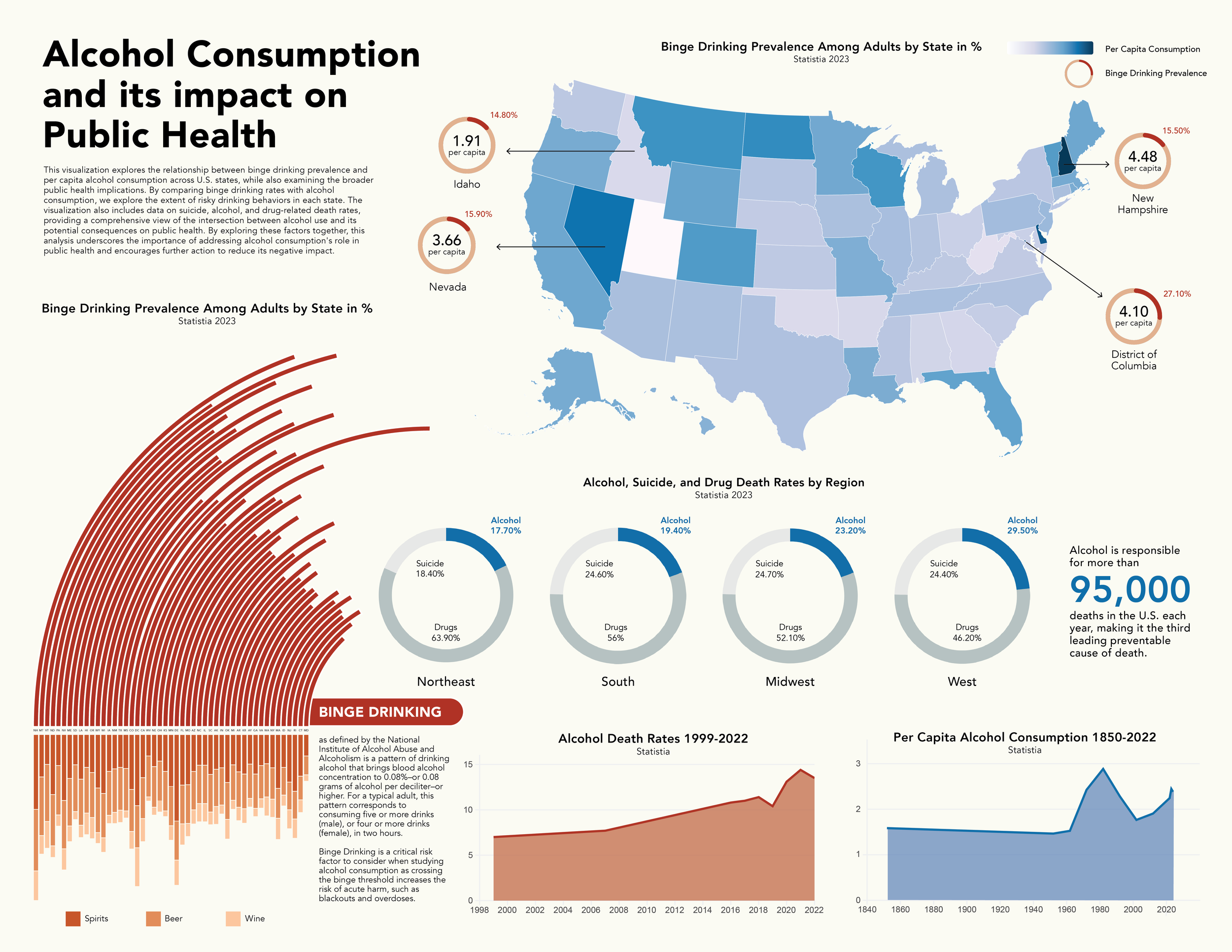
Project Overview
This visualization explores alcohol consumption patterns across the United States using CDC and public health data. The design brings together geographic, categorical, and behavioral indicators to show where consumption is rising, which demographics are most affected, and how various types of alcohol contribute to broader public health trends.
Process
Purpose
These charts compare how beer, wine, and spirits contribute to overall alcohol consumption. This section transitions the viewer from a broad geographic overview to more specific behavioral insights..
Design Rationale
I used donuts instead of bar charts to emphasize proportion and avoid overwhelming the viewer with too many vertical forms after the map. The circular shapes also echo other rounded elements in the poster, creating visual cohesion. Each alcohol type uses a distinct shade within the overall palette, reinforcing category separation while keeping the section harmonized with the cool tones established earlier.
Purpose
The map establishes the national landscape of alcohol consumption, grounding the rest of the visualization in a geographic context. It gives viewers an immediate sense of regional patterns before they dive into specific categories.
Design Rationale
I chose a choropleth-style approach to keep the map clean and interpretable. A cool color progression highlights gradual increases in consumption without exaggerating differences. Subtle borders and labels prevent visual clutter, allowing the viewer to focus on the overall distribution.
Purpose
This graph illustrates binge drinking rates per state in comparison to types of alcohol consumed, completing the narrative introduced by the map and donut charts. These metrics add dimension by showing not just how much alcohol is consumed, but who is consuming it and in what ways.
Design Rationale
I used horizontal bars and flow-style connectors to make the metrics easy to compare across categories. Horizontal alignment supports quick scanning, especially for demographic data that includes multiple labels. This graph uses the warm tones previously seen in the details of the map to create visual continuity across sections discussing binge drinking.
Key Takeaways
This project taught me how to handle dense datasets while maintaining clarity and tone. I learned how important layout rhythm is when combining multiple chart types, and how color consistency can unify complex information. It also showed me the value of designing visual systems that support storytelling, especially when the topic is nuanced or sensitive.