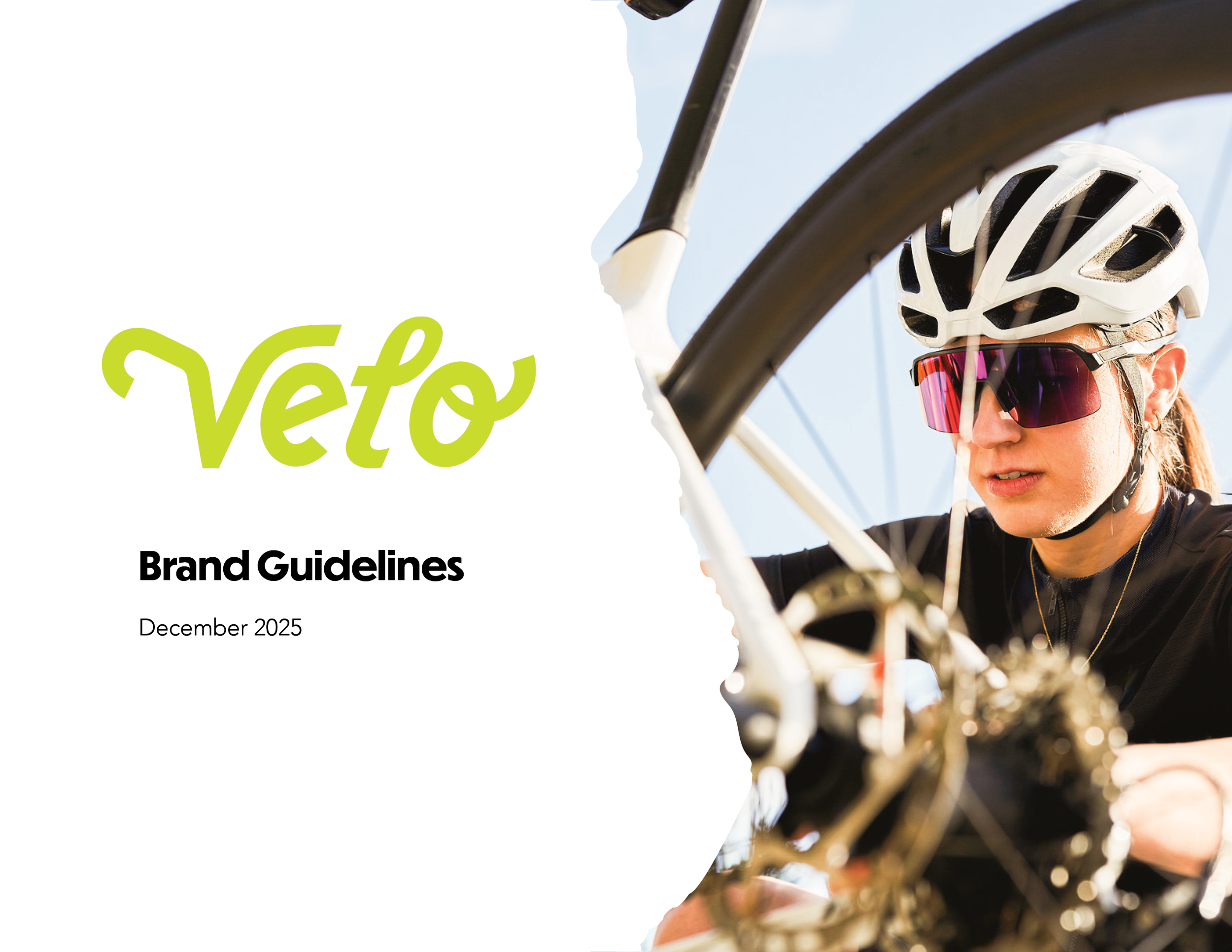
Velo Branding
Complete brand identity for a bicycle accessories and repair company
Project Overview
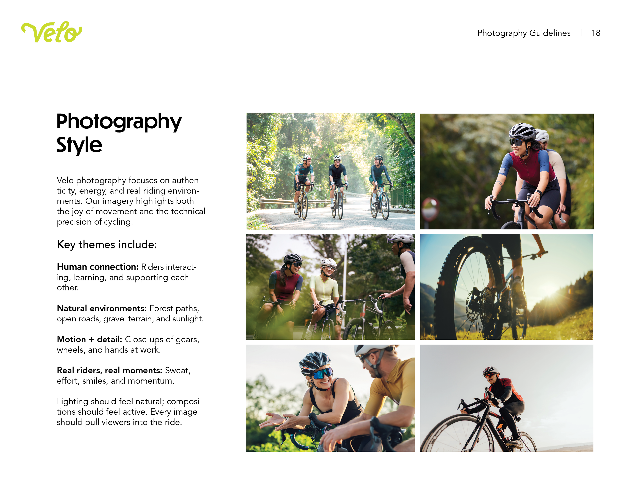
Velo is a bicycle repair and accessories store created for young adults ages 21 to 35. Unlike traditional bike shops focused only on performance, Velo reflects a generation that weaves cycling into daily life, from commuting to weekend exploration, treating the bike as part of their identity.
For this project, I developed a complete identity system that includes logo standards, a color and typography framework, a custom pattern suite, photography guidelines, and a range of branded applications.
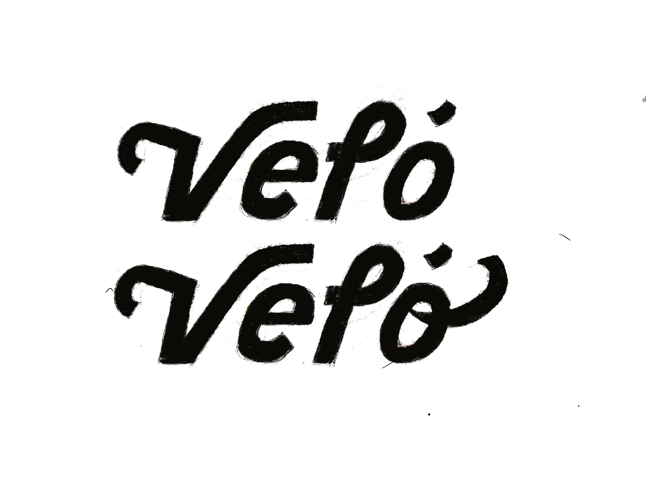
Logo Development
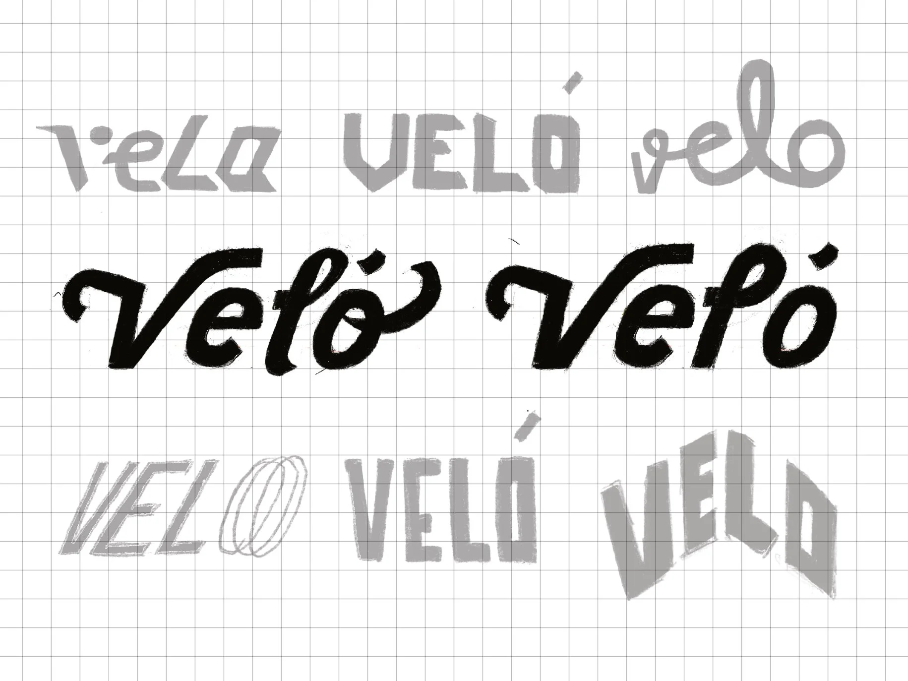
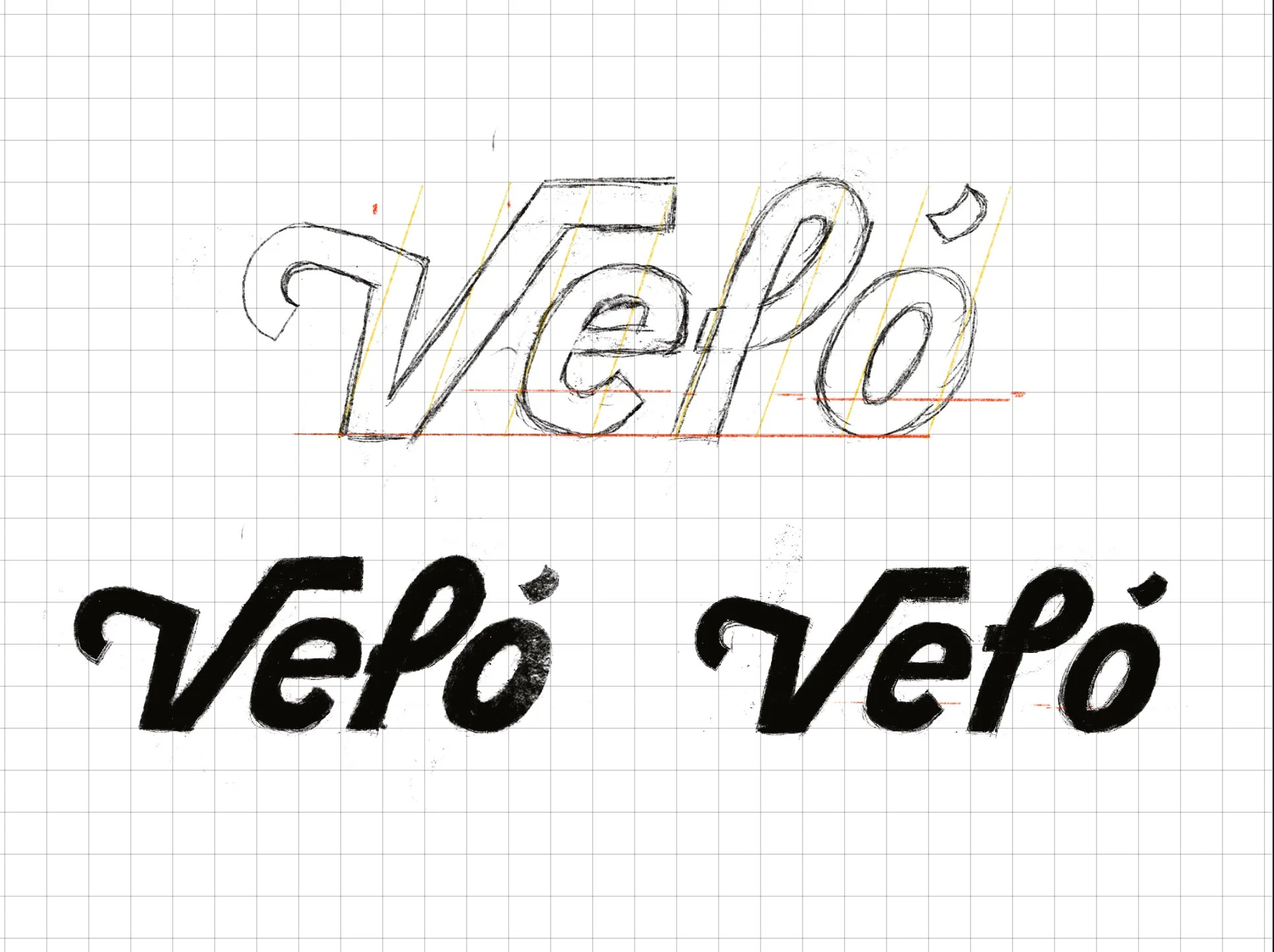


As I began ideating, I looked to early 19th- and 20th-century posters cycling posters to shape the brand’s patterns and motifs. I was interested in how designers of the past once visualized motion before digital tools because using organic forms felt especially relevant to a generation craving authenticity in the age of social media and AI.

Pattern System


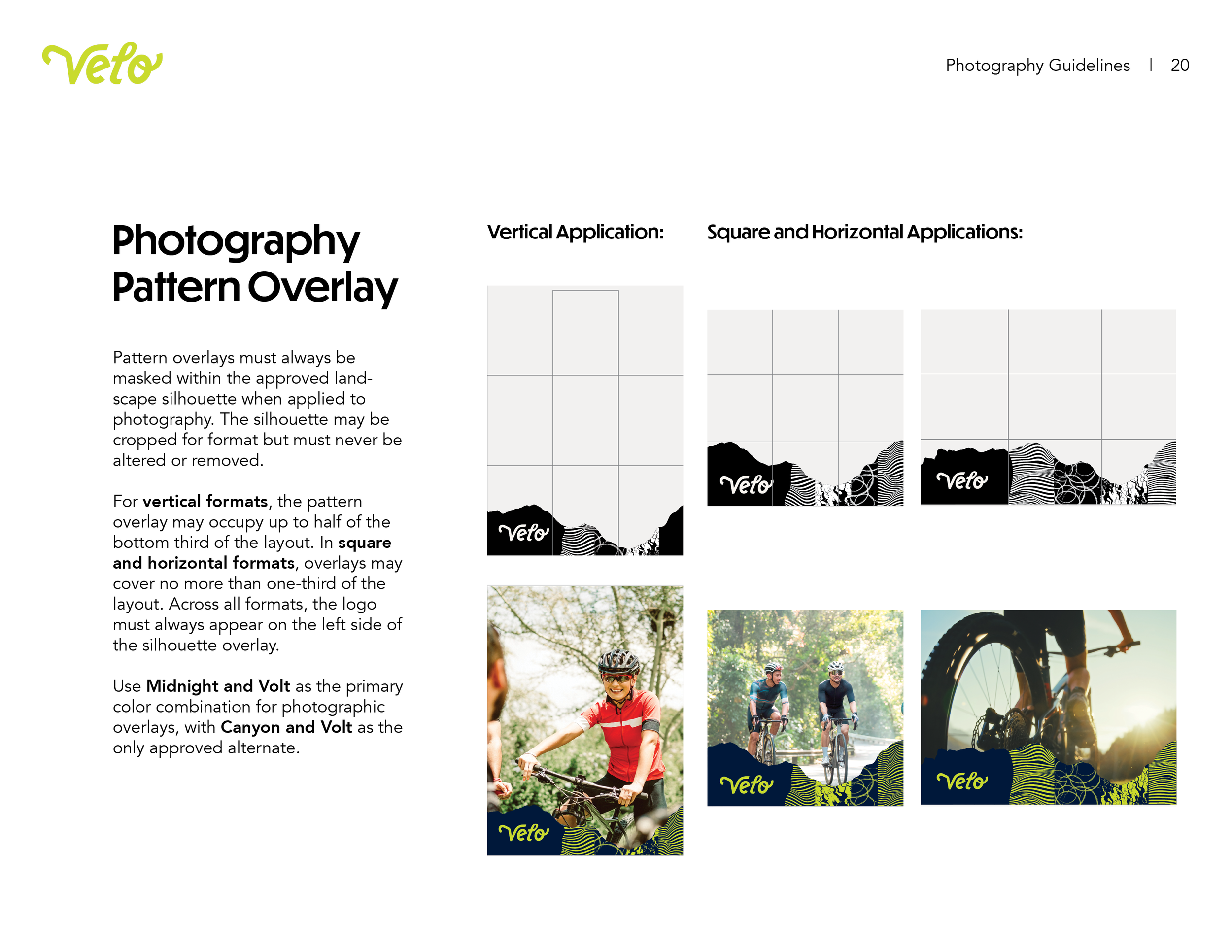
My research into both informal and formal cycling organizations underscored how deeply terrain defines the riding experience. I translated those insights into a pattern suite built from line work, texture, and geometric forms, reminiscent of topographic lines, geographic textures, and wheel tracks.
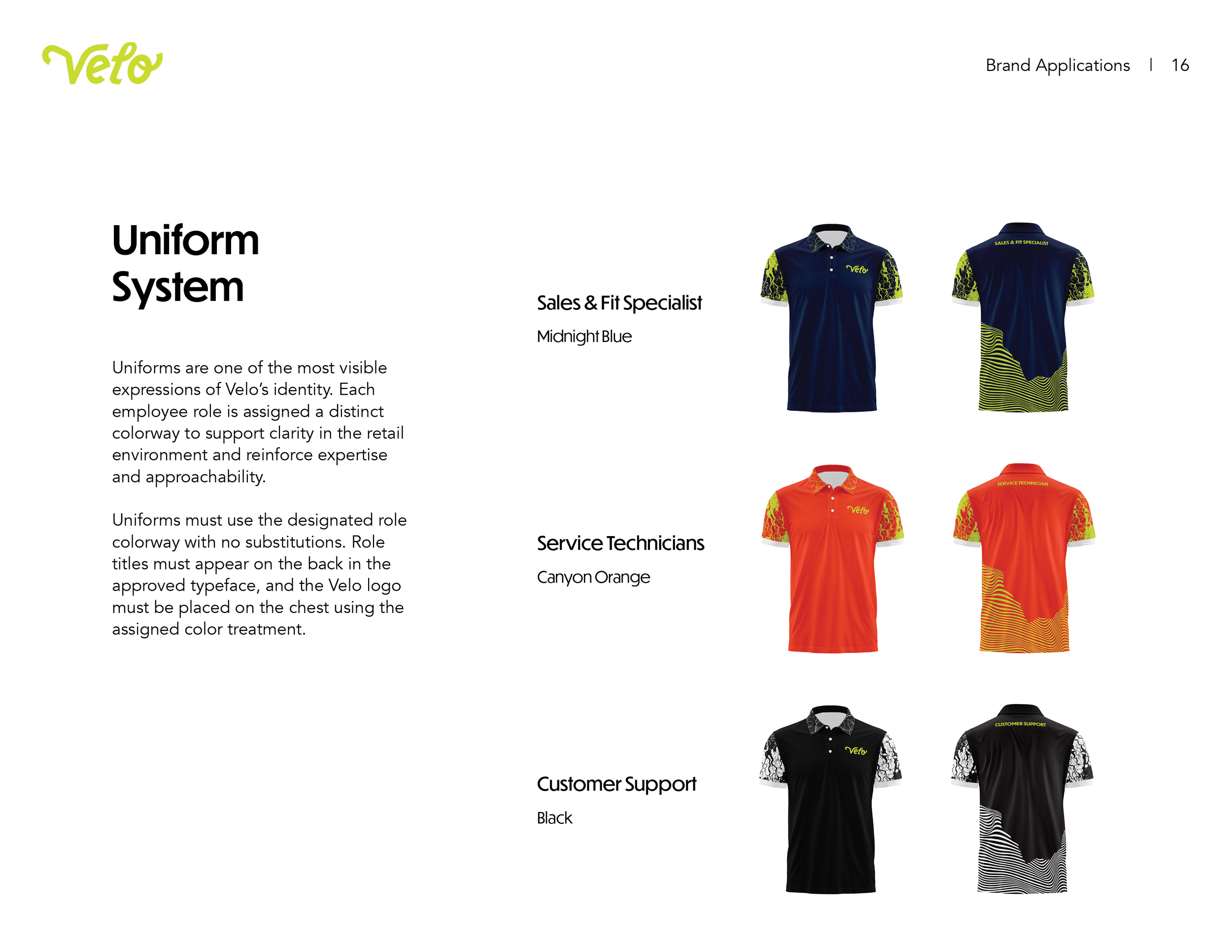
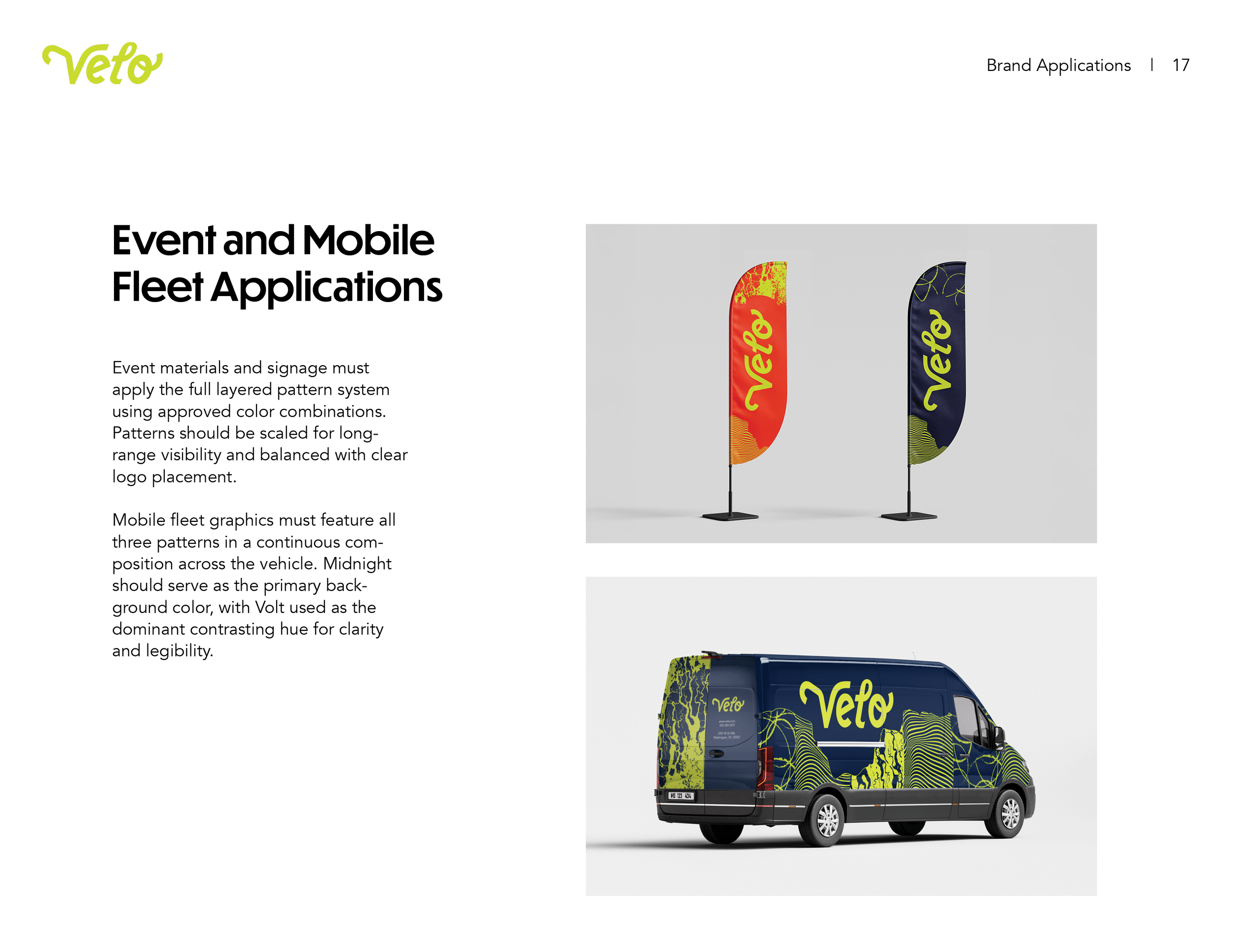
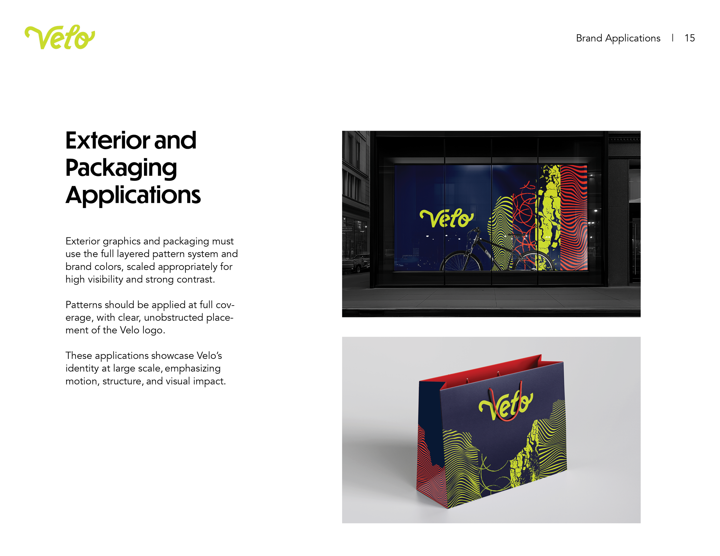
Brand Guidelines
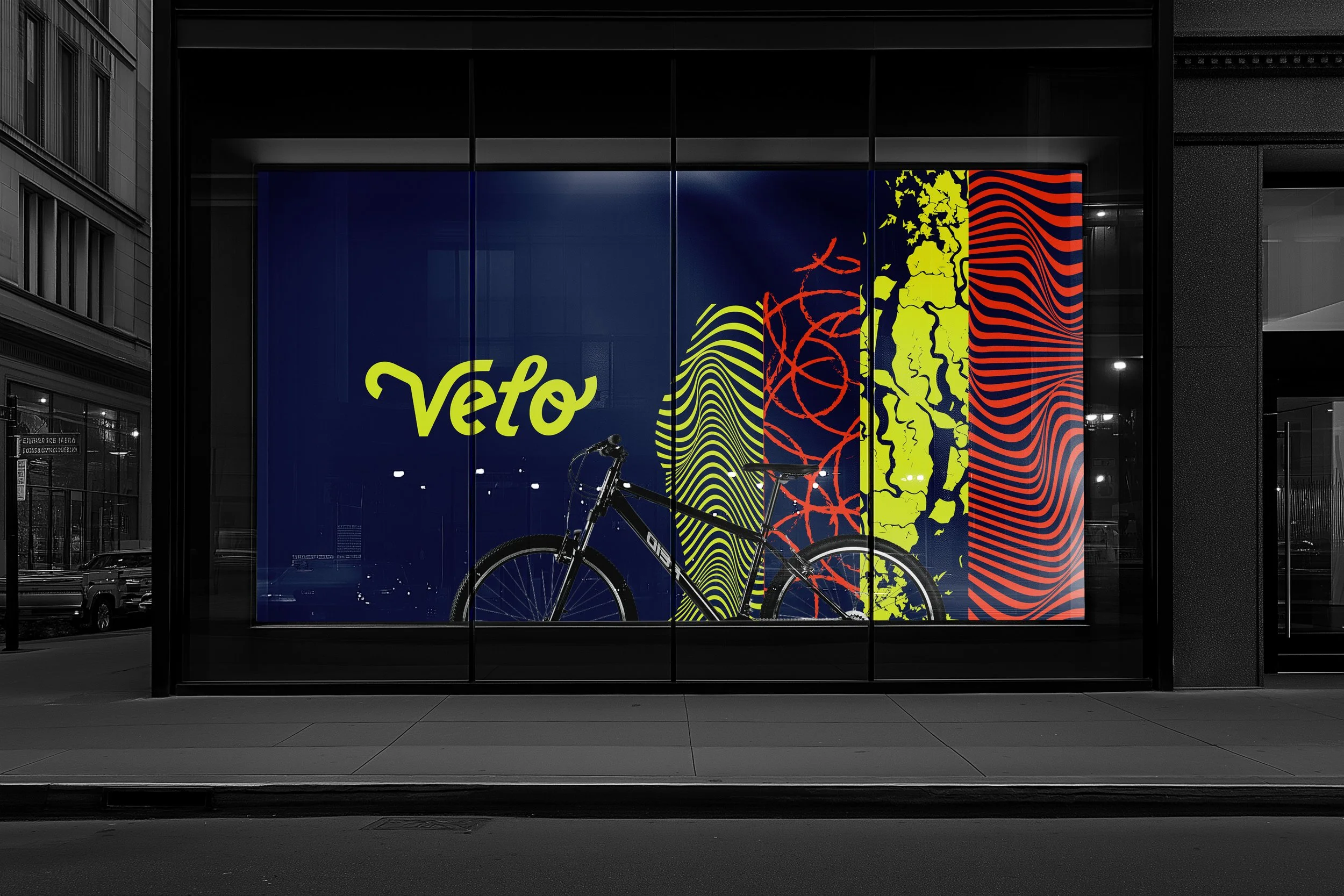
Following the development of these assets, I tested their scalability and legibility across a range of applications, from apparel to storefront signage. Because Velo exists in fast-moving contexts, I prioritized hierarchy, contrast, and clarity to ensure the identity remained recognizable in motion.
To complete this process, I created a full set of brand guidelines focusing on how the brand could scale across digital and print environments.
View full PDF here