Punchbowl Youtube Brand Lift Study
Data Visualization
Project Overview
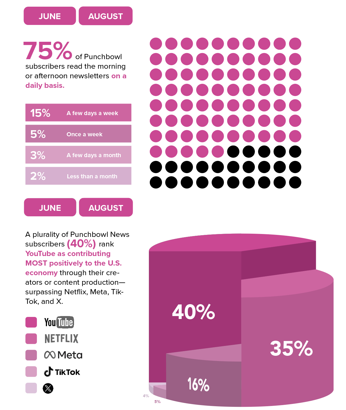
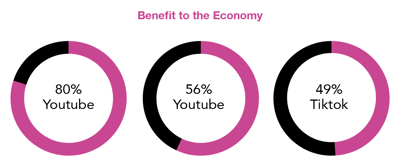
I designed an interactive data visualization for Punchbowl News on behalf of LSG to help communicate the results of a YouTube Brand Lift study to a policy-focused audience. The goal was to present complex survey data in a format that felt clear, trustworthy, and easy to compare across different platforms.
Working as the visual and interaction designer, I created a system that organizes the data into intuitive categories, highlights key insights, and allows viewers to toggle between control and exposed groups. This approach helped transform a dense research report into a more engaging and accessible experience for viewers.
Process
I explored a wide range of chart styles and layout options to understand how different visual forms could communicate the study’s story.
Early experiments included dot-matrix grids, stacked donut variations, and even 3D pie explorations. I tested how each format handled scale, comparison, and emphasis. I iterated across multiple compositions to see how hierarchy and pacing affected readability. This hands-on experimentation helped me identify which combinations best surfaced the key insights while still feeling cohesive, digestible, and visually aligned to the broader Punchbowl visual system.