Mimi’s Handmade Ice Cream
Website Redesign

Project Overview
This project involved redesigning the website for Mimi’s Handmade Ice Cream, a popular DMV-based business celebrated for its unique flavors and rich family history. The brand’s cultural heritage and commitment to community are at the heart of its identity, and the redesign aimed to showcase those values through a modern, responsive website that feels as warm and inviting as the brand itself.
Specific Redesign Objectives:
Create more foot traffic in store locations across the DMV
Generate more inquires regarding the company’s catering services
Improve overall usability and accessibility of the website
This project was completed in collaboration with Sarah Newman. The work displayed reflects my specific contributions. The original logo and branding were provided by the client, and were not part of the scope of the redesign.
Developed on Webflow — The published site can be viewed on https://team-red-mimis-handmade-icecream.webflow.io/
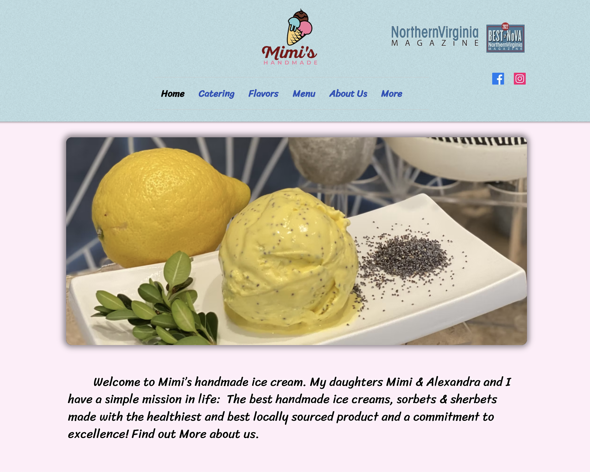
Old Site
After completing the redesign, we had users test the new website using the same tasks that they accomplished
prior to the redesign.
Among all 5 respondents across 12 user testing questions our revamped site saved an average of:
Desktop (1 minute 17 seconds)
Mobile (2 minutes, 9 seconds)
Key Results
Process
Phase 1:
User Testing
In order to observe current user behavior and identify pain points of the current site, I conducted 5 user tests (3 for desktop and 2 for mobile) asking users to complete a series of 12 tasks. These tasks tested how easily users navigated the original website, assessed how intuitive the website’s structure currently was, and evaluated the accessibility of key information.
NOTABLE FINDINGS:
Users took the most time finding soft serve locations, details regarding specific products, and contact information for specific locations
Users struggled with legibility across the website
Users found the navigation of the website confusing
Phase 2: Sitemapping & Wireframing
Phase 3: Implement New Solution
Simply navigation
Consolidate and reorganize key information
Apply accessible and cohesive design elements
Made Mimi’s logo a clickable button to return to the home page to declutter the navigation bar.
Removed the more section in the navigation bar and reorganized information nested under this section in other parts of the website.
Made the home page a portal to other pages in the website. Each section of the home page prompts users to check out other notable pages in the website.
Phase 3.1 Simplify Navigation
Phase 3.2: Reorganize Information
Consolidated the previously separated flavors and menu pages into one menu page as user tests revealed confusion in determining the different purposes of these related pages on the old site.
Moved news articles about the company from the home page to the about us page
Connected their Instagram page to the about us page to ensure the website remains updated
Added a reviews section in the catering page as one of the company’s goals was to generate more catering inquiries and reviews often give brands credibility and encourage consumers to avail of a service


